
Wednesday, 7 May 2014
Tuesday, 21 January 2014
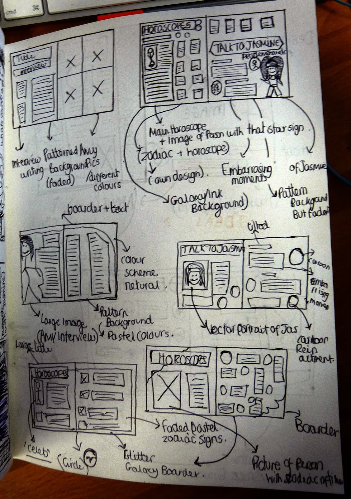
Double Page Spread (Designing) + Final
I created and designed a double page spread (Horoscopes), As I thought it would be different to typical double page spreads associated with fashion magazines, Another reason I chose to do a horoscope page was the fact it allowed me to give a hand made and unique and quirky style to it..
Although I am quite happy with the outcome I feel that if I had the chance to re-make my double page spread in the future I would make create a bigger contrasts between both images and texts size.

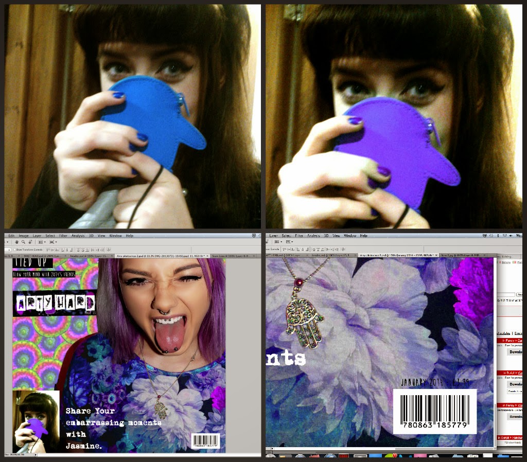
Final magazine - Double Spread

I added the image, along with cutting down the amount of 'zodiac' signs I had, making the page less busy, as my horoscope page lacks white space.

I also decided to cut out the background of amy as the block image, drew the eye to the left hand of the page.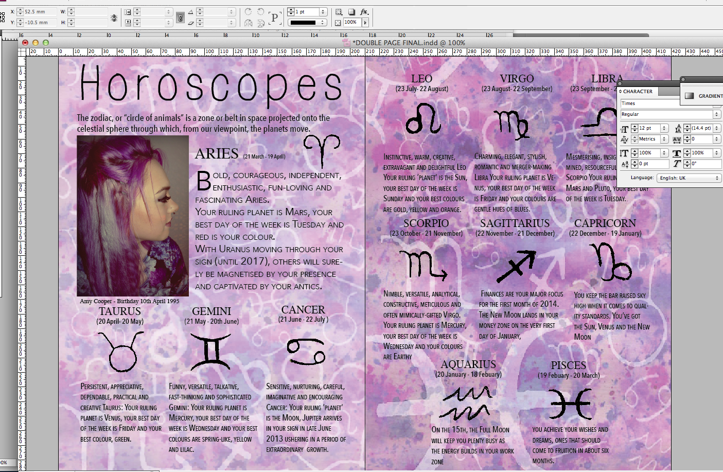
Here is the small contrast between the light and dark (original page)

I then came to the conclusion that my background needed to be made lighter so that the text would contrast instead of merge into the background.


I added a drop cap on the letter 'B' of Bold, which makes the magazine double page spread look more professional as a lot of magazines use drop caps within there work.

Whilst 'tweeking' my design, i decided to change my font to 'Mossy' as it contrasted better with my other type faces.

I also added a web address at the bottom of the page as well as a page number - making it more realistic.

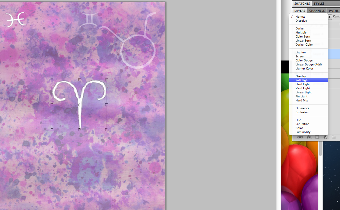
Instead I decided to use my zodiac symbols as they were more simplistic. I placed each symbol in a new PSD, saved it and the placed it into 'indesign'.


I then designed these characters and coloured them in, however I realised that the characters colour scheme would be to much of a contrast and not fit in with my purple/pink colour scheme. (Not using - Development)

I then added all my text to the sheet ( all genuine snippets of horoscopes)


I created two different designs for my double page spread, added them to in design and added my header 'HOROSCOPES' which font had previously been used on my front cover when 'promoting' the horoscopes page. I decided to also use another picture of Amy as she is the cover, this then connects both my front cover and double page spread. Keeping the purple pink colour scheme.
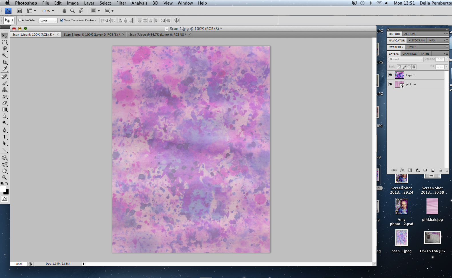
After scanning all my pieces to create my double page spread background, I combined them using photoshop.


Here is the hand drawn zodiac signs and characters using black ink, along with the pink background I overlapped on a low opacity over the ink splatter (seen above)

Using interest, I got inspiration when looking at the different zodiac signs and characters, in order to design my own.


Above creating an ink splatter background and the final draft for my double page spread.
Wednesday, 15 January 2014

Tuesday, 14 January 2014
Double Page spread (Magazine Research)

After carefully cutting and collecting images and typefaces from various magazines which have inspired me in designing my front cover and double page spread, I created a mood board which contains different typefaces as well as different ways of representation models and fashion/accessories.


Wednesday, 18 December 2013
My Magazine (Mock)

My Final Magazine Front Cover! ( and below corrected masthead!)


(Here I made a big mistake of missing out the 'P' in exPose' which was a silly mistake, However this is corrected on my final piece! (:

I wrote and measured the Word 'EXPOSE' and then cut it out using a craft knife, and then sprayed the shapes and letters. (seen below)


Not one of my best drawings! But Large Scamp draft of a potential front cover and photographed image of my friend Amy.

Contact sheet ( Possible front cover images)
6 out of 16 of my images taken were taken without the flash, and therefore I was not keen on using them for my final as it also effected the quality of the image.
Over all I was undeceive over Image 5-6-8 (shown in rought drafts above) However Finally I have decided to use Image 8 as Amy's facial expression enhances and shows of her piercings and unique style.


Tuesday, 17 December 2013
Magazine Scamps

Fashion magazine - front cover Scamps (Drawn using black biro)

Monday, 9 December 2013
Parody - Parisian Fame (Mucha)

This is my final Parody piece.
As you can see from the stages below, Firstly I sketched out the background and then edited/coloured and put it together in photoshop.
I then Took a picture of my friend Amy's Tattoo who looks a lot like the female ' Sarah bernhardt' in the original piece, after colour and editing these together with a textured effect.
I flipped the image, so that it would match the oringinal piece, However I prefer the unflipped image.
 I then took a picture of my friend Amy's tattoo, and then selected the face and edited it on photoshop, in doing this I added another layer and by lowering the opacity coloured it.
I flipped the image, so that it would match the oringinal piece, However I prefer the unflipped image.


 Here I firstly coloured the bottom layer as accurate as possible and then (above)n over layer the central piece, I then added a layer giving the background a textured effect.
Once I'd scanned them and placed them in photoshop, I then used 'Levels' to contrast the black and white making it easier to colour when editing.

 Original Piece.

free hand out the Parisain Frame.

Subscribe to:
Comments (Atom)