My Final Magazine Front Cover! ( and below corrected masthead!)
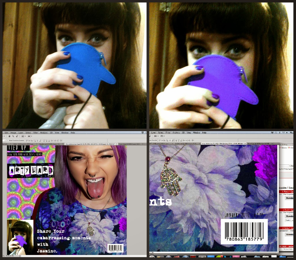
For the subheading 'Share your embarrassing moments' I used an image I had taken of my friend Jasmine with a embarrassed cheeky facial expression, which worked in well with the subheading 'embarrassing moments' Again to fit in with the purple pink colour scheme I changed the hue on Jasmines Penguin Purse and Nail varnish.
Seen below is how I put it all together.. I cut Amy out on photoshop, used a drawing that I had already designed, over lapping the pattern and changing the hue to make it 'fit' in with Amys Purple hair and Purple dress. From then I added my hand made header along with subheadings and a range of typfaces some hand made and some found on 'dafont.
(Here I made a big mistake of missing out the 'P' in exPose' which was a silly mistake, However this is corrected on my final piece! (:
I wrote and measured the Word 'EXPOSE' and then cut it out using a craft knife, and then sprayed the shapes and letters. (seen below)
Final rough draft for magazine magazine front cover ( Images + editing above to support)
Another potential Magazine cover ( rough draft - scamp) and Photographed image.
Not one of my best drawings! But Large Scamp draft of a potential front cover and photographed image of my friend Amy.
Contact sheet ( Possible front cover images)
6 out of 16 of my images taken were taken without the flash, and therefore I was not keen on using them for my final as it also effected the quality of the image.
Over all I was undeceive over Image 5-6-8 (shown in rought drafts above) However Finally I have decided to use Image 8 as Amy's facial expression enhances and shows of her piercings and unique style.
On the left I created a Mindmap to give me inspiration into choosing a name for a magazine, Eventually I came up with the Masthead 'EXPOSE'.


I'm on the fence about this, while more customization is good, I have a feeling this is a "in-progress" update, it just feels incomplete and half-way there.
ReplyDeleteWe use badge layout for apps on design approvals (visual projects), so the image being displayed is important. Old layout "feels like" it had larger images,
maybe because the images were cropped more loosely so it's easier to tell which project it was at quick glance. Now the image is cropped closer, making it
harder to scan thru at quick glance. I find myself needing to click into the project more often than usual. Which makes the whole user experience less
efficient.
I have a couple suggestions that might make it work better:
1. Increase the height of the window the cover image is being displayed.
2. Let us to choose which image to be displayed as "cover" (like how Pinterest handles cover images of each board, was hoping for this for a long time)
3. Let us adjust which part of the image to show and how tight or loose the crop is (with a fixed window, let us move the image around and maybe enlarge or
shrink it to control what shows thru the window. Pinterest does a limited form of this, which is very useful in making the cover image relevant)
4. Allow Cover Image to be ordered in different hierarchy (currently every element can be ordered differently except the Cover Image, it seems to be stuck
in the 2nd spot, would like the option to set it on another spot in the layout. This one seems like an easy fix, since you guys allow that for every other
element already)