

Wednesday, 20 November 2013
My Magazine Research

Tuesday, 19 November 2013
ELLE - Magazine cover copy

I then added the grey background, moved it to the back and then added Hayleys cut out moving it to the front.

On photoshop I created the grey background and on another tab I lasso tooled Hayley.

(This didn't work)
When applying the image in, 'InDesign' because of the 'LL' being covered I had to lasso tool the background removing it, creating my own background and a cut out of Hayley with no background. ^ (shown two above)

For my first front cover copy NME I started off by copying the type on the page first, so I decided this time I would take my picture first.
When taking the picture with my friend Hayley, i positioned a light to get the light and dark tones (shadow) placing her against a white background. The outcome wasn't as enhanced as I'd of liked so I used photoshop to add some lighter parts, as well as giving a darker effect around the eyes to match Mary Kate's eye make up, along with green eyes.
Friday, 8 November 2013
Re Designing John's Business Card

In class we were given an awful business card of which we needed to redo so that it would have a better and more structured alignment.
 I then had another attempt on redesigning Johns business card for the second time.
I used a range of different typefaces so that they would contrast making the business card more interesting and exciting. (:

I used a range of different typefaces so that they would contrast making the business card more interesting and exciting. (:
Thursday, 7 November 2013
Look Double Page Analysis

Original Double page - Look Magazine

Contrast
1. orange sticker against grey background 7. white font against dark image
2. big white typeface/ small white typeface 8. curled typeface and times typeface
3. small white times typeface/ bold white type face 9. white box against dark clothing
4. black typeface against white background 10. white typeface against black box
5. black subheading with highlighted pink word 11. Pink writing against black box
6. times medium typeface/ small black typface

Repetition
1. Change of colour through sentence 5. white box with black writing/pricetag
2. Blipp to buy 6. 1,2,3
3.Small romans typeface 7. bold hand written type
4. subheadings in pink for a person+style. 8. pink arrows

Alignment
1. Left alignment 3. vertical alignment
2. subheadings aligned

1. Yay! Its the look 8. That's okay ladies
2. We collaborated 9. Lily's Coat
3. we're excited 10. Vanessa's skirt
4. available in store 11. Millie's Blazer
5. Diamond 12. Styling Tips
6. Debenhams 13. And there's more..
7. Celebs wear high street too.
Look Magazine Analysis

Original Look front cover

Contrast
1. black font/neon sticker 6. dark pink box/light pink font
2. big/small font 7. white font/brown hair
3. pink font/white background 8. regular/italic
4. black font/white background 9. big pink/small pink
5.red/blue 10. red lipstick/pale skin

Repetition
1. curly end 6. Repetition of Price Stickers
2. typeface 'K' 7. Alliteration 'F' - Fab Flats
3. black typeface 8. bold black typeface
4. Repetition of the word 'LOVE' 9.White highlighted Pink
5. Repetition of shoes 10. Black type over white background

Alignment:
1. Header Alignment 3. Centeral Alignment
2. Right Alignment 4. Left Alignment
2. Right Alignment 4. Left Alignment

Proximity:
1. Special Price 5. 60 seconds
2. 'LOOK' 6. Fab Flats
3. Online Store 7. Amazing Interactive
4. KateTherapy 8. 500 Fashion&Beauty Hits
Sunday, 3 November 2013
Vogue Double Page Analysis
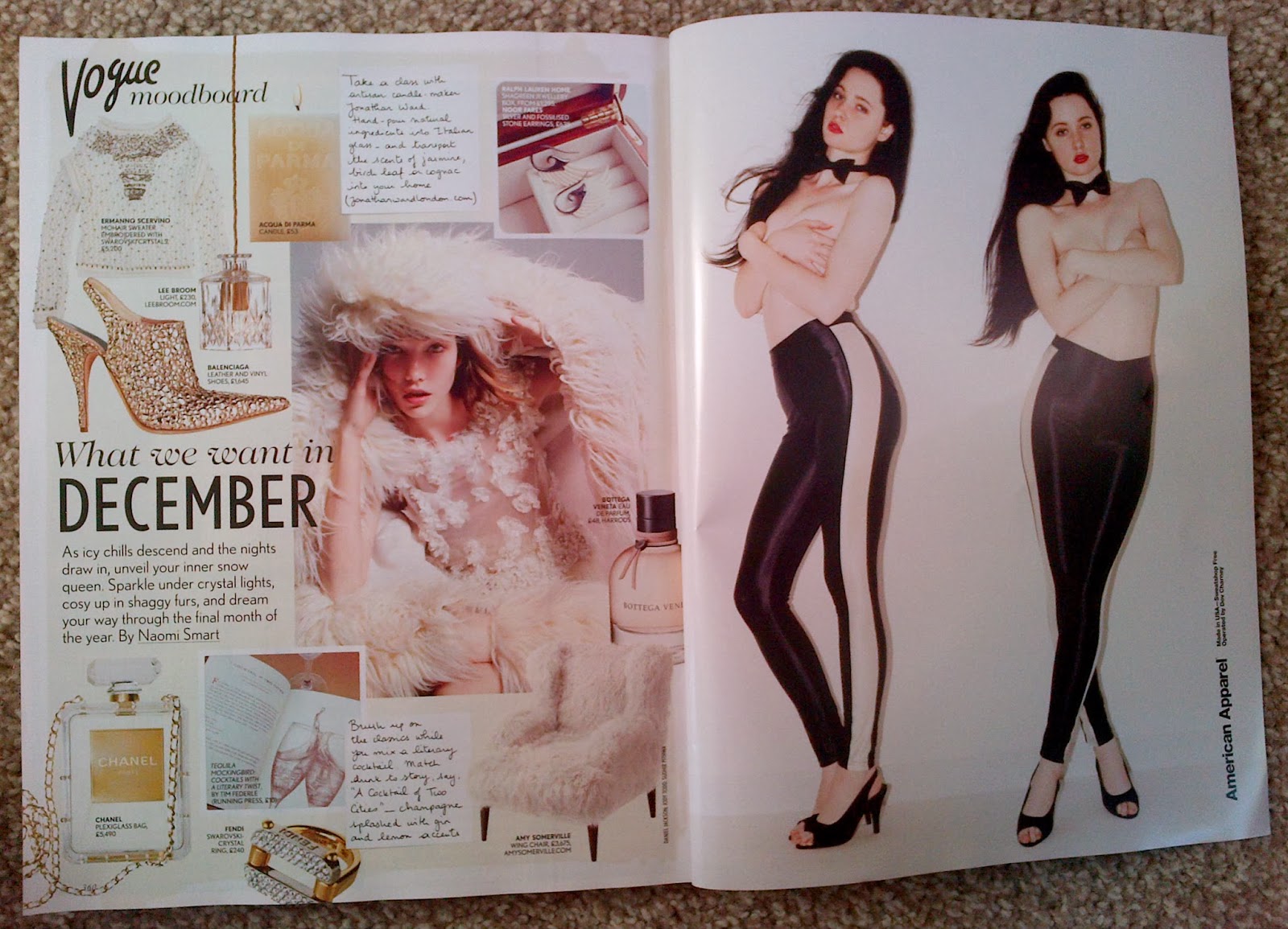
Original Vogue double page spread

Contrast:
1. White space/ Image 5. Bold/Thin black text2. Red lipstick/pale face 6. Black text/White background
3. Black/cream material 7. curled font/square-block font
4. Handwritten/Typed 8. Upper/Lower Case

Repetition:
1. Model 5. Perfume
2. Clothes 6. hand written font
3. What the product is + price 7. Jewelry
4. Alliteration 'W' 8. Black font

Alignment:
1. Right Alignment 4. Centered spine
2. Left Alignment
3. centered text boxes


Proximity:
1. Vogue 5. icy chills
2. Mood Board 6. writing 2
3. writing 1 7.Amercian Apparel
4. December
Vogue Cover Analysis

Original Vogue Cover Dec 2013

Contrast:
1. Bold/Thin 6. Italic/Bold2. Black writing/white background 7. dark/light skin tones
3. Red writing/white background 8.small text/middle sized text
4. Header large font/ Subheadings Smaller font 9. White space/Text/Image
5. Upper/Lowercase 10. White/Brown

Repetition:
1. RedLipstick/Red font 6. black font
2. Bold red font 7. cream background + coat
3. italic thin font 8.Honey tones in Header/Hair/Skin/Eyes
4. bold black font 9. Repetition of the word 'AT'
5.red font 10. Kerning (space between letters/font)

1. Heading/Title 5. Barcode
2. Left hand alignment 6. Centeralised Large font
3. Eye to kerning between 'Designer Special' 7. centeralised Smaller font
4. Right hand alignment

1. logo/header 5. Game of Thrones 9. At Home
2. British Fashion 6. John Galliano
3. Bringing Sexy Back 7. High Tech Heroines
4. Luxury Underwear 8. Design Special
Subscribe to:
Posts (Atom)