
Wednesday, 27 November 2013
Saturday, 23 November 2013
Vogue and Look Magazine Analysis
Vogue and Look Magazine Analysis.
I specifically bought these two magazines because of the contrast between two different classes in society which is shown through the front cover page and the contents VOGUE being for the upper and more elite class and LOOK for the working class/popular culture, However both aimed at women aged between 17 - 40. Not only that but I also noticed that both magazines 'VOGUE' and 'LOOK' feature the very famous model Kate Moss on the front cover, and through the image shows again the clear contrast between the two magazines, VOGUE features an exclusive modelling shoot where Kate is represented by giving a reserved yet seductive body language and facial expression and which would of cost a lot of money and shows the close relationship between top supermodel Kate Moss, giving the impression to the reader that their articles are reliable and elite. Whereas LOOK used a standard picture, which has been taken on an everyday occurrence for their front cover, giving the impression that their magazine gives a more casual/lifestyle/gossip approach of the super model. Not only that but Kate Moss is a role model for a range of different ages maximizing the target audience.
The front cover of VOGUE is quite minimalist and organised. The title of the page and the main cover-line are in line with each other and the fonts and colours that are used contrast well together. There is some white space which has utilised well.
The hierarchy of the page makes the readers eye flow from the bold and thin serif type masthead, down the left hand site of the page (left alignment) to the subheadings, This is because the brain/eyes automatically make eye contact with the larger text on the page moving down to the smaller text catch your eye first, as Larger text is usually the main subject and is what draws in the reader.
The way the reader looks at the page is determined by the size, font, colour and positioningof the text. There is a variety of sans serif type faces which range in size, giving the cover a lot of variation. The colour-scheme used is very contrasting as it shows cold white and blacks which contrast with warm reds, these specific colours have been used because it has been published as a Christmas (December) addition. There is no graphic ornamentation this is probably because the magazine producers want to keep the magazine looking extremely class and prestige, although the magazine includes basic institutional information such as a the date the magazine was published, the price and the bar-code.
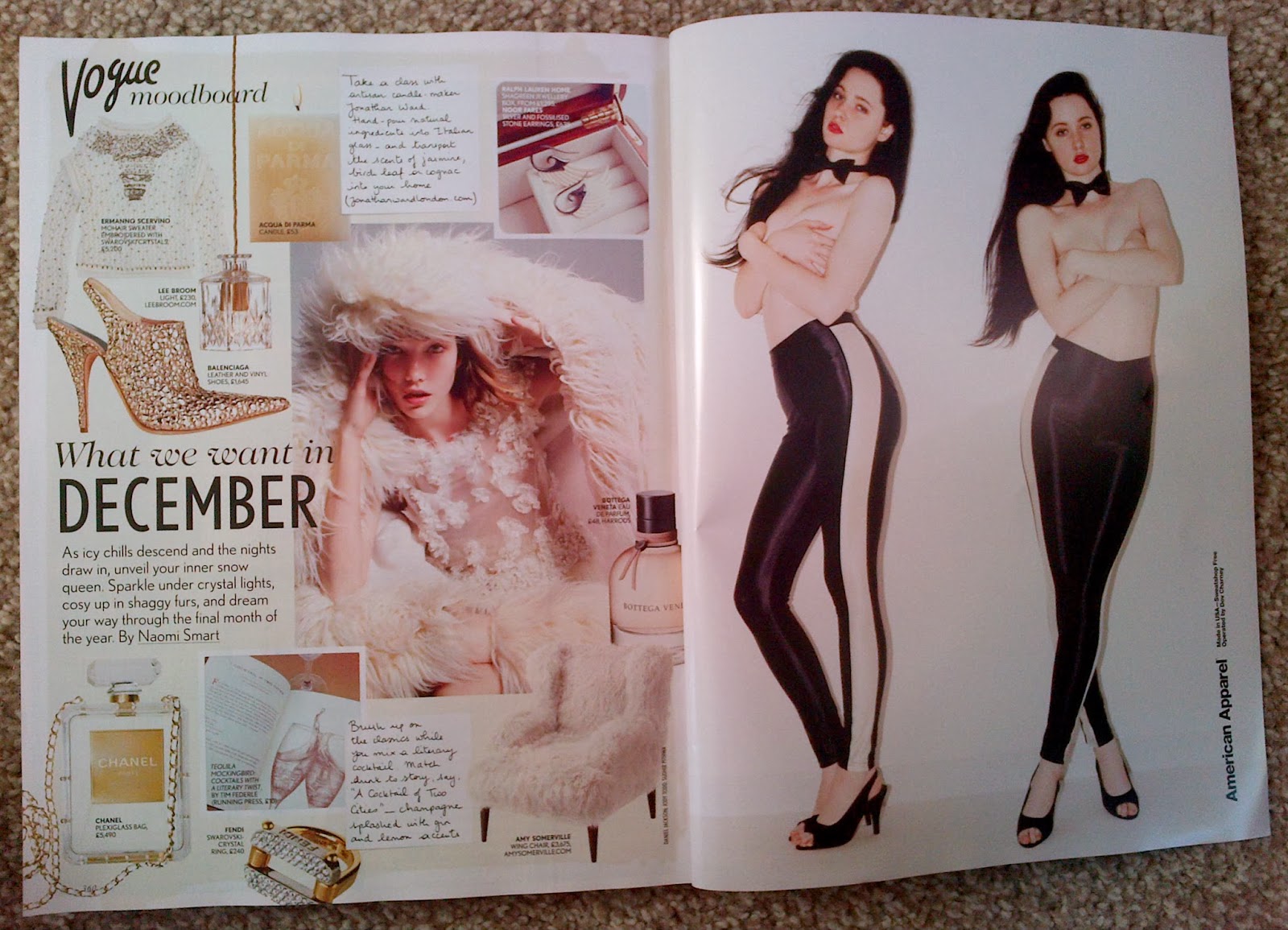
The double page within VOGUE uses a range images of all sizes at different angles some overlapping others, this is to add contrast between them making them more interesting, it uses a range of different typefaces making the page contrasting making the page more exciting and diverse.
There has been a grid used for the single page spreads but the images are not structured and move of that which makes it look more appealing. Overall layout of the magazine uses calm yet christmas colours such as white like show and gold like Christmas decor giving the magazine look formal, expensive and minimalistic.
The front cover of LOOK is very busy and full of text however here is some white space making the magazine look more organised.The magazine is very popular and appeals to women aged between 17-40 that are interested in celebrity gossip and new fashion trends.
The most prominent thing on the cover is the masthead because of its striking bold serif display text, throughout the cover both sans serif and serifare used this is to add contrast to the page making it more modern. The image on the cover contrasts well with the colour of the writing that is used, not only that but by having more than one image on a front cover gives the reader a variety of other images making the magazine look a 'good buy' as its bursting with fashion and high street deals.
The hierarchy like VOGUE makes the readers eye flow across then down from the left hand side of the page to the right hand side of the page, along with a variety of different sized text in the modern and feminine complimentary colours of hot pink, white and black.There is alot of graphic ornamentation as the magazine readers want to make the cover look as busy as possible so that the magazine has a wider target audience making more people want to buy and read it. For example the sticker 'special price' in the top left hand corner uses a neon yellow background which is very striking and makes the reader want to buy the magazine because of its saving price, The magazine cover also uses boxes and labels to make it more interesting.
Look magazine also includes institutional information such as the date the magazine was published, the price, the bar-code and puff codes i.e ' Kate - The new therapy changing her life'.
The double page within LOOK is busy but also uses some white space to group the different subheadings i.e 'Lily's coat'. It uses a range of different serif fonts and colours, however it does have a structure and uses ornamentations such as arrows and boxes to make it easy on the eye. The hierarchy of this magazine draws the reader to look at the images before the text, because the images are of celebrities wearing high street branded clothes (main subject) which is the logical way of analysis something as a reader, something we all do.
Overall both of these magazines are targeted at women interested in fashion, however they both have two very different target audiance, VOGUE for the upper class, advertising expensive designer clothing and accessories whereas LOOK which also explored more into celebrity lifestyles and gossip as well as the latest high street affordable fashion. Personally I really like the VOGUE magazines design because of its fresh clean feel because of the expensive quality, however because the LOOK magazine is targeted more at me I feel that what its offering me is more relevant for me as an individual.
Wednesday, 20 November 2013
My Magazine Research

Tuesday, 19 November 2013
ELLE - Magazine cover copy

I then added the grey background, moved it to the back and then added Hayleys cut out moving it to the front.

On photoshop I created the grey background and on another tab I lasso tooled Hayley.

(This didn't work)
When applying the image in, 'InDesign' because of the 'LL' being covered I had to lasso tool the background removing it, creating my own background and a cut out of Hayley with no background. ^ (shown two above)

For my first front cover copy NME I started off by copying the type on the page first, so I decided this time I would take my picture first.
When taking the picture with my friend Hayley, i positioned a light to get the light and dark tones (shadow) placing her against a white background. The outcome wasn't as enhanced as I'd of liked so I used photoshop to add some lighter parts, as well as giving a darker effect around the eyes to match Mary Kate's eye make up, along with green eyes.
Friday, 8 November 2013
Re Designing John's Business Card

In class we were given an awful business card of which we needed to redo so that it would have a better and more structured alignment.
 I then had another attempt on redesigning Johns business card for the second time.
I used a range of different typefaces so that they would contrast making the business card more interesting and exciting. (:

I used a range of different typefaces so that they would contrast making the business card more interesting and exciting. (:
Thursday, 7 November 2013
Look Double Page Analysis

Original Double page - Look Magazine

Contrast
1. orange sticker against grey background 7. white font against dark image
2. big white typeface/ small white typeface 8. curled typeface and times typeface
3. small white times typeface/ bold white type face 9. white box against dark clothing
4. black typeface against white background 10. white typeface against black box
5. black subheading with highlighted pink word 11. Pink writing against black box
6. times medium typeface/ small black typface

Repetition
1. Change of colour through sentence 5. white box with black writing/pricetag
2. Blipp to buy 6. 1,2,3
3.Small romans typeface 7. bold hand written type
4. subheadings in pink for a person+style. 8. pink arrows

Alignment
1. Left alignment 3. vertical alignment
2. subheadings aligned

1. Yay! Its the look 8. That's okay ladies
2. We collaborated 9. Lily's Coat
3. we're excited 10. Vanessa's skirt
4. available in store 11. Millie's Blazer
5. Diamond 12. Styling Tips
6. Debenhams 13. And there's more..
7. Celebs wear high street too.
Look Magazine Analysis

Original Look front cover

Contrast
1. black font/neon sticker 6. dark pink box/light pink font
2. big/small font 7. white font/brown hair
3. pink font/white background 8. regular/italic
4. black font/white background 9. big pink/small pink
5.red/blue 10. red lipstick/pale skin

Repetition
1. curly end 6. Repetition of Price Stickers
2. typeface 'K' 7. Alliteration 'F' - Fab Flats
3. black typeface 8. bold black typeface
4. Repetition of the word 'LOVE' 9.White highlighted Pink
5. Repetition of shoes 10. Black type over white background

Alignment:
1. Header Alignment 3. Centeral Alignment
2. Right Alignment 4. Left Alignment
2. Right Alignment 4. Left Alignment

Proximity:
1. Special Price 5. 60 seconds
2. 'LOOK' 6. Fab Flats
3. Online Store 7. Amazing Interactive
4. KateTherapy 8. 500 Fashion&Beauty Hits
Sunday, 3 November 2013
Vogue Double Page Analysis
Original Vogue double page spread

Contrast:
1. White space/ Image 5. Bold/Thin black text2. Red lipstick/pale face 6. Black text/White background
3. Black/cream material 7. curled font/square-block font
4. Handwritten/Typed 8. Upper/Lower Case

Repetition:
1. Model 5. Perfume
2. Clothes 6. hand written font
3. What the product is + price 7. Jewelry
4. Alliteration 'W' 8. Black font

Alignment:
1. Right Alignment 4. Centered spine
2. Left Alignment
3. centered text boxes


Proximity:
1. Vogue 5. icy chills
2. Mood Board 6. writing 2
3. writing 1 7.Amercian Apparel
4. December
Vogue Cover Analysis

Original Vogue Cover Dec 2013

Contrast:
1. Bold/Thin 6. Italic/Bold2. Black writing/white background 7. dark/light skin tones
3. Red writing/white background 8.small text/middle sized text
4. Header large font/ Subheadings Smaller font 9. White space/Text/Image
5. Upper/Lowercase 10. White/Brown

Repetition:
1. RedLipstick/Red font 6. black font
2. Bold red font 7. cream background + coat
3. italic thin font 8.Honey tones in Header/Hair/Skin/Eyes
4. bold black font 9. Repetition of the word 'AT'
5.red font 10. Kerning (space between letters/font)

1. Heading/Title 5. Barcode
2. Left hand alignment 6. Centeralised Large font
3. Eye to kerning between 'Designer Special' 7. centeralised Smaller font
4. Right hand alignment

1. logo/header 5. Game of Thrones 9. At Home
2. British Fashion 6. John Galliano
3. Bringing Sexy Back 7. High Tech Heroines
4. Luxury Underwear 8. Design Special
Subscribe to:
Posts (Atom)