My Final Magazine Front Cover! ( and below corrected masthead!)
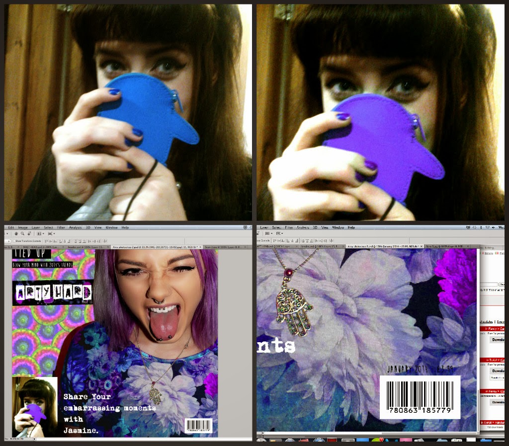
For the subheading 'Share your embarrassing moments' I used an image I had taken of my friend Jasmine with a embarrassed cheeky facial expression, which worked in well with the subheading 'embarrassing moments' Again to fit in with the purple pink colour scheme I changed the hue on Jasmines Penguin Purse and Nail varnish.
Seen below is how I put it all together.. I cut Amy out on photoshop, used a drawing that I had already designed, over lapping the pattern and changing the hue to make it 'fit' in with Amys Purple hair and Purple dress. From then I added my hand made header along with subheadings and a range of typfaces some hand made and some found on 'dafont.
(Here I made a big mistake of missing out the 'P' in exPose' which was a silly mistake, However this is corrected on my final piece! (:
I wrote and measured the Word 'EXPOSE' and then cut it out using a craft knife, and then sprayed the shapes and letters. (seen below)
Final rough draft for magazine magazine front cover ( Images + editing above to support)
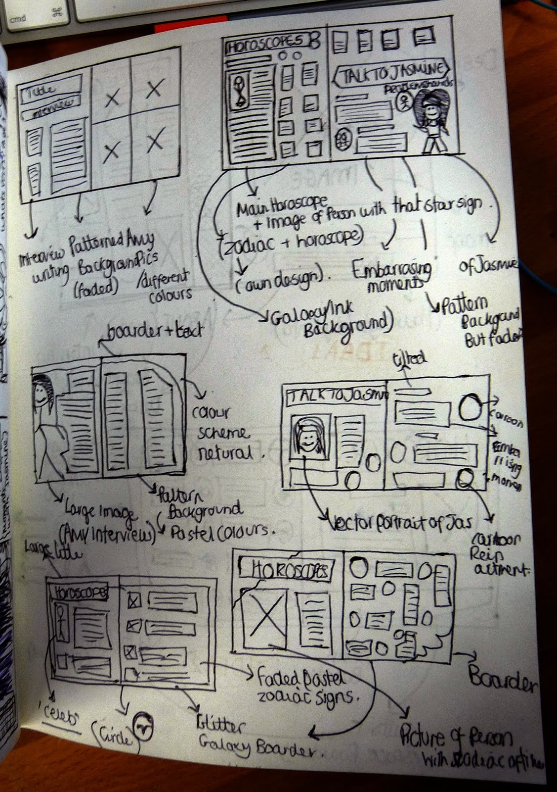
Another potential Magazine cover ( rough draft - scamp) and Photographed image.
Not one of my best drawings! But Large Scamp draft of a potential front cover and photographed image of my friend Amy.
Contact sheet ( Possible front cover images)
6 out of 16 of my images taken were taken without the flash, and therefore I was not keen on using them for my final as it also effected the quality of the image.
Over all I was undeceive over Image 5-6-8 (shown in rought drafts above) However Finally I have decided to use Image 8 as Amy's facial expression enhances and shows of her piercings and unique style.
On the left I created a Mindmap to give me inspiration into choosing a name for a magazine, Eventually I came up with the Masthead 'EXPOSE'.




 Here I firstly coloured the bottom layer as accurate as possible and then (above)n over layer the central piece, I then added a layer giving the background a textured effect.


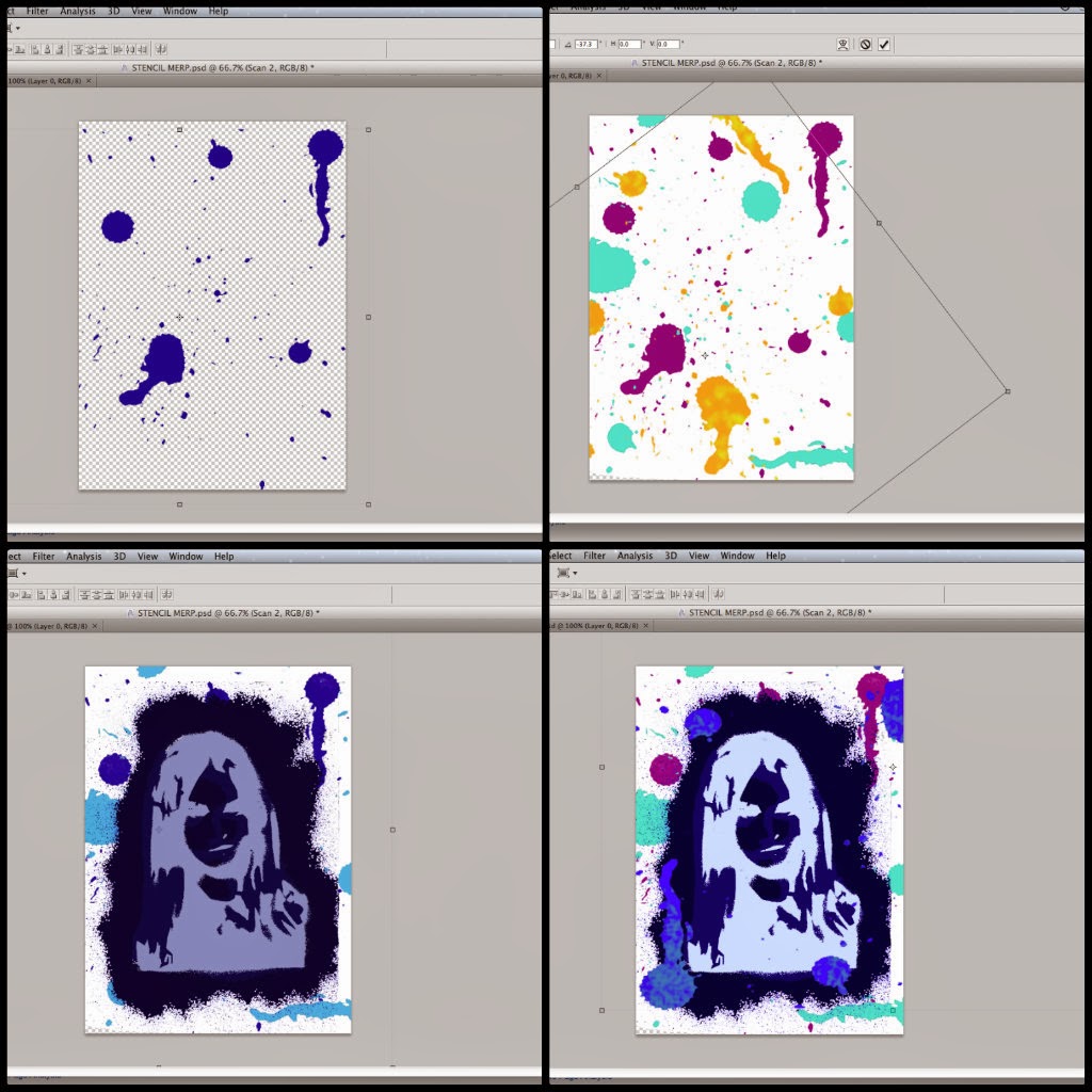 I then made ink splodges,scanned them in coloured them and layered them to get an ink splattered effect.
 Once I'd removed the white space and background from my image using photoshop I then ctrl+c and shift backspace, this therefore changed the black stencil spray to my desired colour.

